Illusionists with Images
Bob Kenedi
Expressing my impressions about the subject, not just showing its visual image has long been my main photographic objective. But how? The cameras only capture light not impressions.
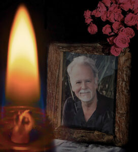
Now and then I felt that I found an acceptable answer to my question but one specific challenge, namely recreating the impact of an effective light source within the image, has doggedly continued to elude me. The photo of figure 1A is an example where the candle in the image fell far too short from the much more major role it should have in the image in lighting up the subject and the scene. That shortcoming has long remained a conundrum to me.
At one of the FCCC annual conferences a few years ago, Vincent Versace opined, that “we photographers, are in the optical illusion business”. The more I thought about that, the more his rather startling statement started to make sense to me. It certainly gave me a valuable added perspective to the search for my solution, but not an answer. Then, entering a gallery at Artis Naples a few years ago, French painter Gaston La Touche’s painting “ The Joyous Festival” (Figure 2A) gave me a jolt! It gave me what I was looking for. An illusion of that painting being lit up by an active lantern within it. So, how did he do it?
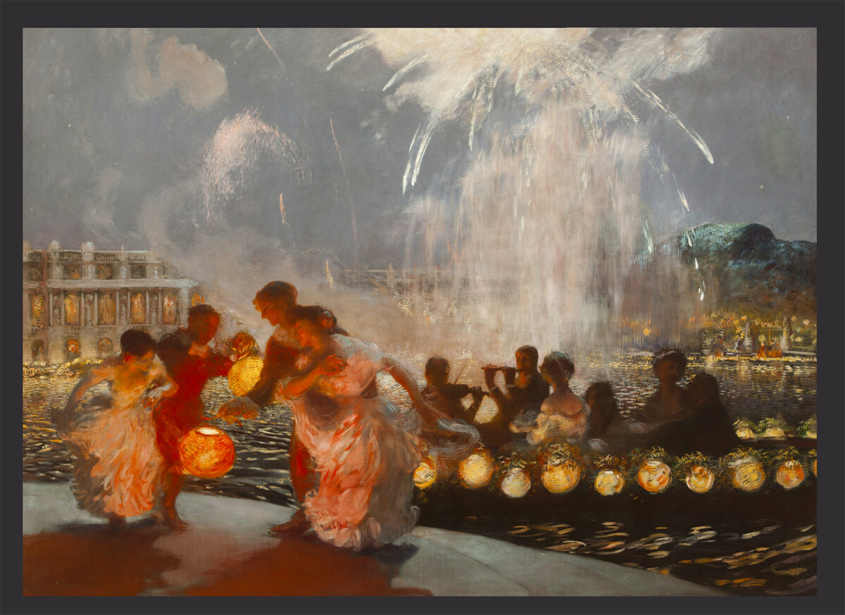
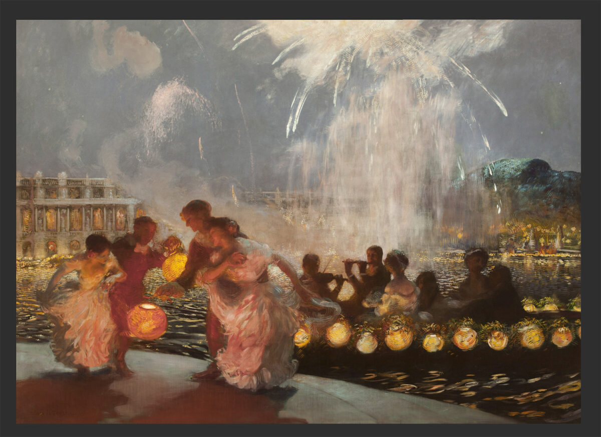
I was approaching the painting excited, but instead of learning something about the secret behind my haunting conundrum, the effect faded away (Figure 2B) and the only meaningful conclusion I could draw was that Versace is absolutely right, it is all about creating illusions! The question remained, what will create the right illusion?
The door to getting a useful working answer was suddenly opened for me when in one of his excellent PUG (Photoshop User Group) presentations Richard Tindell, highlighted for us a rather oblivious — but for this issue very important — color characteristic: For different colors the brightness we perceive versus the brightness measured are different, and that difference is color dependent. Also that it is the red color for which the difference is the highest!
This took me back to Ansel Adams who wrote: “Dodging and burning are steps to take care of mistakes God made in establishing tonal relationships.” Wouldn’t Adams say today to us that “adjusting color intensity (saturation) is the step to take to take care of color relationships?” We tend to exploit this effect almost routinely when we move the color sliders given to us to optimize our color to B&W conversions, but what about the effect within a color image? What was said about the red, took me back to the Gaston La Touche painting, and that’s what made this a big AHA!!! moment for me. Spelled out the above, this means that:
What the camera measures and records does not match with what we perceive.
As a result, we lose in our captured image data the brightness impact of the red colors relative to all other colors unless we compensated.
Further, if we loose the relative strength of the red color (and close-by colors) then we lost the most important element to express the impact of light sources.(Figure 2b.)
I encourage you to experiment as follows:
Step 1, find a photo of your own which is NOT overexposed, and has an important light source in it. I chose Figure 1a.
(Figure 1a is a composite photo in memory of a deceased past club member who was a friend, a photographer, a teacher, a DPI-SIG member, and a creative printer at HITEK, who is greatly missed by all of us who knew him.)
Step 2, open it in Photoshop; (high-key will not work, some red color must exist to be able to adjust it in the following steps.)
Step 3, place a Hue/Saturation Adjustment Layer above it; Step 4, change the Master setting to Red and increase saturation, leaving all other settings untouched;
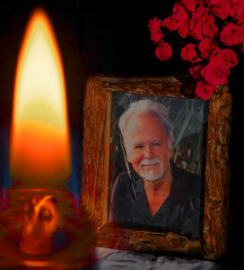
Step 5, turn the visibility of the Adjustment Layer On-&-Off and adjust Saturation to explore the difference at the different settings(Figure 1B).
A closing thought. Using Photoshop’s Hue & Saturation Adjustment Layer was for me the simplest way to experiment and to illustrate the effect, but it is not the only, nor necessarily the best way to make color intensity balance adjustments. That adjustment works on the Red RGB component of the image. It is possible to use the ACR (Adobe Camera Raw) “Color Mixer” sliders which are available in Lightroom as well. Those sliders work each on a narrower color spectrum. While finer adjustments may be possible, that makes a bit more complicated to achieve the desired effect.